One of the classes at Vancouver Film School focussed on helping us create our personal brand. Below are some of the ideas that I considered for my new logo before choosing the one you see at top of this web page. When you mouse over the photos you'll see why that idea was not used.
If you'd like me to design a logo for you in either 2d or 3d please contact me.

This logo concept was based on the classic idea that photographers and artists will frame up a shot by forming a pair of L's with their fingers. Unfortunately an L formed with the thumb and fore finger is often used as a symbol meaning loser. Not a winner.

Alright then why don't I get rid of the fingers but keep the whole framing the shot idea.
Should I go with 4x3 or 16x9 for the aspect ratio of the camera viewfinder? And what about the focus spot?
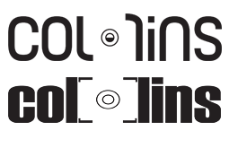
Do people who've only shot digital even recognize what a 35mm split prism focus spot looks like?
Maybe if I get rid of the grey screen the camera idea might be clearer... or maybe it's less obvious.
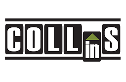
Let's try a different approach. Since I'm interested in editing, what if each letter of my name looked like a frame of film with part being edited IN to the strip of film? Let's mock this one up in various sizes and see how it looks with black text on white frames.

What if the two L's in my name were on separate strips of overlapping film that are going to be stuck together.
C'mon... Does anybody still glue film together?
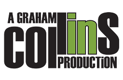
I like the offset but those upper case L's don't work for me.
Hmmm... if I increase the offset I could add some additional letters. This might work as an animated title ut that n is bothering me

What about that green triangle? Someone suggested trying a dashed line on IN to suggest something missing or something about to appear.
What's missing is my enthusiasm for using the dashed lines in my logo.

I definitely ike this better as a white on black design because it makes the green triangle pop. What if I want to use the logo for my other businesses? Maybe I should ditch the productions tag line.
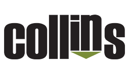
Hmmm... almost there but...
I think the top of the c o and s should line up with the top of the L's and don't forget to go back to white text on black.
