- home
- projects
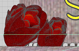
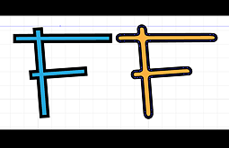
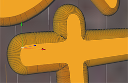
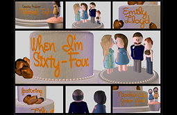
This is where you will find video clips from my High Definition (HD), Standard Definiton (SD),3D modelling & animation or logo & print projects. When you mouse over the smaller images you can learn a little bit of the process used to create each project.
Demo Reel
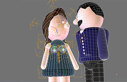
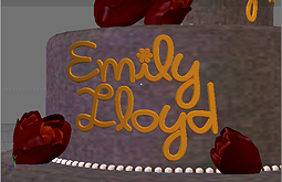
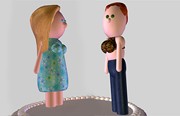
3D Projects
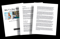
Logos & Print
- photo gallery
Stills and Video Frame Captures
- contact
- Graham Collins
- Vancouver, BC
- 604-689-8767
- or Toll Free
- 866-472-4262
- e-mail: graham AT grahamcollins.com